> ## Documentation Index
> Fetch the complete documentation index at: https://cometchat-22654f5b-docs-llms-scoped-indexes.mintlify.site/llms.txt
> Use this file to discover all available pages before exploring further.
# Message Bubble
> Message Bubble — CometChat documentation.
`CometChatMessageBubble` is the reusable components which forms different types of message bubbles accordingly.
There are different section available in message bubble which can be altered by passing `CometChatMessageTemplate` in `CometChatMessages`
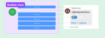 ## Sections
Following are the sections in message bubble
1. Header View
2. Leading View
3. Content View
4. Bottom View
5. Thread View
6. footer view
#### Properties
| Properties | Type | Description |
| - | - | - |
| **LeadingView** | () => JSX.Element | used to set view in leading View section |
| **headerView** | () => JSX.Element | used to set view in header view section |
| **replyView** | () => JSX.Element | used to set view in reply view section |
| **contentView** | () => JSX.Element | used to set content view , by default all different type of bubble are shown here |
| **threadView** | () => JSX.Element | used to set view in thread view section , by default threaded section is shown |
| **footerView** | () => JSX.Element | used to set footer view for message bubble , by default message receipt is shown |
| **alignment** | 'left' \| 'right' \| 'center' | used to set bubble alignment , can be **left**, **right** and **centar** |
| **style** | [MessageBubbleStyle](/ui-kit/react-native/v4/message-bubble#style) | used to set styling properties foe message bubble |
| **bottomView** | () => JSX.Element | used to set bottom view for message bubble , by default reactions are shown here |
### style
| Properties | Type | Description |
| - | - | - |
| **height** | string \| number | used to set height |
| **width** | string \| number | used to set width |
| **backgroundColor** | string | used to set the background colour |
| **border** | BorderStyle | used to set border |
| **borderRadius** | number | used to set border radius |
This documentation is built and hosted on [Mintlify](https://mintlify.com), a developer documentation platform.
## Sections
Following are the sections in message bubble
1. Header View
2. Leading View
3. Content View
4. Bottom View
5. Thread View
6. footer view
#### Properties
| Properties | Type | Description |
| - | - | - |
| **LeadingView** | () => JSX.Element | used to set view in leading View section |
| **headerView** | () => JSX.Element | used to set view in header view section |
| **replyView** | () => JSX.Element | used to set view in reply view section |
| **contentView** | () => JSX.Element | used to set content view , by default all different type of bubble are shown here |
| **threadView** | () => JSX.Element | used to set view in thread view section , by default threaded section is shown |
| **footerView** | () => JSX.Element | used to set footer view for message bubble , by default message receipt is shown |
| **alignment** | 'left' \| 'right' \| 'center' | used to set bubble alignment , can be **left**, **right** and **centar** |
| **style** | [MessageBubbleStyle](/ui-kit/react-native/v4/message-bubble#style) | used to set styling properties foe message bubble |
| **bottomView** | () => JSX.Element | used to set bottom view for message bubble , by default reactions are shown here |
### style
| Properties | Type | Description |
| - | - | - |
| **height** | string \| number | used to set height |
| **width** | string \| number | used to set width |
| **backgroundColor** | string | used to set the background colour |
| **border** | BorderStyle | used to set border |
| **borderRadius** | number | used to set border radius |
This documentation is built and hosted on [Mintlify](https://mintlify.com), a developer documentation platform.