> ## Documentation Index
> Fetch the complete documentation index at: https://cometchat-22654f5b-docs-llms-scoped-indexes.mintlify.site/llms.txt
> Use this file to discover all available pages before exploring further.
# ReactionList
> ReactionList — CometChat documentation.
The `CometChatReactionList` component is used to manage and display reactions in messages. It provides functionalities like fetching reactions when a message is updated, updating the reactions, and observing when the user has scrolled to the end of the reaction list.
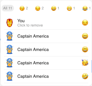 ## Properties
| Properties | Type | Description |
| - | - | - |
| `messageObject` | CometChat.BaseMessage | The message for which reactions are being fetched or managed. |
| `reactionListStyle` | object | Styling property to customize the appearance of the reactions list component. |
| `avatarStyle` | object | Styling property to customize the appearance of the avatar component. |
| `listItemStyle` | object | Styling property to customize the appearance of the list item component. |
| `reactionsRequestBuilder` | CometChat.ReactionsRequestBuilder | The request builder for fetching reactions. If not provided, a new one is created with a default limit. |
| `loadingIconURL` | string | URL for the loading icon. |
| `errorIconURL` | string | URL for the error icon. |
| `reactionItemClicked` | function | A function that handles the click event on the reaction list items. It can be used to remove a reaction. |
## Usage
```html theme={null}
```
## Styles
### ReactionListStyle
| Attributes | Type | Description |
| - | - | - |
| `height` | string | The height of the reaction list component. |
| `width` | string | The width of the reaction list component. |
| `borderRadius` | string | The border radius of the reaction list component. |
| `background` | string | The background color of the reaction list component. |
### AvatarStyle
| Attributes | Type | Description |
| - | - | - |
| `width` | string | The width of the avatar. |
| `height` | string | The height of the avatar. |
| `borderRadius` | string | The border radius of the avatar. |
### ListItemStyle
| Attributes | Type | Description |
| - | - | - |
| `activeBackground` | string | The background color when the list item is active. |
| `hoverBackground` | string | The background color when the list item is hovered over. |
This documentation is built and hosted on [Mintlify](https://mintlify.com), a developer documentation platform.
## Properties
| Properties | Type | Description |
| - | - | - |
| `messageObject` | CometChat.BaseMessage | The message for which reactions are being fetched or managed. |
| `reactionListStyle` | object | Styling property to customize the appearance of the reactions list component. |
| `avatarStyle` | object | Styling property to customize the appearance of the avatar component. |
| `listItemStyle` | object | Styling property to customize the appearance of the list item component. |
| `reactionsRequestBuilder` | CometChat.ReactionsRequestBuilder | The request builder for fetching reactions. If not provided, a new one is created with a default limit. |
| `loadingIconURL` | string | URL for the loading icon. |
| `errorIconURL` | string | URL for the error icon. |
| `reactionItemClicked` | function | A function that handles the click event on the reaction list items. It can be used to remove a reaction. |
## Usage
```html theme={null}
```
## Styles
### ReactionListStyle
| Attributes | Type | Description |
| - | - | - |
| `height` | string | The height of the reaction list component. |
| `width` | string | The width of the reaction list component. |
| `borderRadius` | string | The border radius of the reaction list component. |
| `background` | string | The background color of the reaction list component. |
### AvatarStyle
| Attributes | Type | Description |
| - | - | - |
| `width` | string | The width of the avatar. |
| `height` | string | The height of the avatar. |
| `borderRadius` | string | The border radius of the avatar. |
### ListItemStyle
| Attributes | Type | Description |
| - | - | - |
| `activeBackground` | string | The background color when the list item is active. |
| `hoverBackground` | string | The background color when the list item is hovered over. |
This documentation is built and hosted on [Mintlify](https://mintlify.com), a developer documentation platform.